In the Design section:
Design
How Can I Make Sure My Design Works?
Structure and Navigation
Have you visited a site in search of a specific piece of information, and found it very difficult and time-consuming to locate, or even given up because you cannot find it? This may be due to one of two reasons: either the information isn't contained in the website at all, or the website is structured in a way that is different from what you would expect, so that by following what you believe to be a logical path to such information, you cannot find it. Or perhaps you don't even know where to start.
This is a symptom of a badly-designed information structure, or at least a structure to which you find it difficult to relate. You could do with some help, perhaps; but you cannot find it.
When designing your e-government website, you want to avoid this. The visitors to your site should be put in the position to find the information they want as easily as possible, or the site will be useless to them.
This is where "user testing" comes in. By developing the structure of your website in consultation with users, and testing design solutions on the way, you will probably manage to avoid the pitfalls described above, and deliver a site that makes sense to its visitors.
There are two aspects it would help to test when you design the structure of your site - information architecture and user behaviour:
Information Architecture
This refers to the way information is logically organised and grouped into different sections.
In order to gather information on this, you don't necessarily need to use a computer: for example, an easy and inexpensive way of doing this is to prepare a set of cards with a description of different items of information on them, and ask prospective users to group them according to their way of seeing things (ideally, at this stage of your project you should already know what information you will publish on your site (see: What Information Will You Publish/Exchange Through Your Website? ) but note that it may also help to ask the users you are testing if there are any bits of information they would expect to find on the website, which you haven't provided on your cards - as an additional way to gather information on their expectations). Users should then also suggest a name, or title, for each group of cards: this will give you precious information on possible names for the sections of the site, which you can reflect in your navigation system.
By repeating this test with different potential users and comparing results, you will be able to identify patterns , i.e. common ways in which users group different pieces of information.
For instance, you may notice that users always locate a specific piece of information within a specific group, or section: this will provide you with an indication on where to position this information within your site so that it makes sense to users, and is therefore easy to find. You may also find that a piece of information is "allocated" to different sections by different users, i.e. that it does not appear to belong to just one category. In this case, when you distribute information on the site, it may help to publish this piece of information in more than one section ("redundancy" is not necessarily a bad thing in websites), or at least to provide links to such information from different sections of the site.
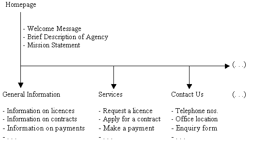
After carrying out this test a few times with different users, you will probably be in the position to establish the ideal way in which to group and distribute information on the site, based on the patterns you have identified. This represents the information architecture of the site: the best way to record this is with a diagram , displaying the different sections of the site and listing the items of information they contain (see the example below).
User Behaviour
This refers to the way in which your typical user moves from one document to another in your website, i.e. to the navigation system of your site. In order to test this, you will have to develop one or more preliminary versions of the interface of your site, i.e. a prototype of the actual graphical layout and link system that users will be confronted with when they visit your site. You can do it by using the same tools you would use to produce the final version of the site (see: What Do I Need To Design A Website? ) or by asking your design team to do it, if you have one.
When you develop this prototype (also called a mock up), you will need to include the main links to the different sections of the site (these are usually grouped into a navigation bar), a "search" button if you choose to implement one (highly recommended), and any other elements that help the user move from one document to another (e.g. direct links to specific pieces of information, rather than to sections). You should then create sample pages which stand in for what will be the final pages of your site, populate them with specific items of information (a heading and an explanatory paragraph will normally do, i.e. you don't need to be in possession of all the content of the site at this stage), and link them together as they would normally be in your site.
Then, make a list of actions, or tasks, that your users are likely to want to undertake when they visit your site (you may find it helpful to discuss this list with users themselves, of course, to make sure you don't miss any important ones). These tasks could include things like "Find information on the agency's opening hours", or "Request document xyz", "Apply for a licence", "Pay fee for xyz service", etc.
Finally, ask your users to carry out these tasks using the prototype interface you developed, and observe their behaviour. You can do so by standing next to them or behind them while they do this, and taking notes: whatever you do, you should make sure that you don't interfere with what they are doing (e.g. by making suggestions or comments). You should also make sure that users understand that it is not them who are being tested, but the interface of the site (so that they don't feel under inappropriate pressure).
By observing the behaviours of users while they try to fulfil different tasks, you will understand whether the interface makes it easy or not for them to do so. For instance, if users are puzzled and don't know where to start, or if they click on links that do not eventually take them to the information requested, it is likely that the navigation system you have planned is not appropriate. The same could be said if users have to click many times to find the information they are looking for: in real life, it is likely that they would give up after a few clicks, and - say - pick up the phone to call the agency, or abandon the task altogether (remember, users of websites are normally accustomed to finding information fast). If this is the case, you may want to review the way you have designed the navigational system of your site. In order to do so, it also helps to sit down with users after the test and ask them how the system could be improved.
By repeating these tests a number of times and reviewing design at different stages, you will eventually end up with what is likely to be a useable and user-friendly navigational system, at least for a large majority of your users.
How Many Test Users?
You don't need a very large number of test users: often, testing with just 3-4 users will already provide you with precious information. Of course, the more users you can work with, the better; but you should always keep in mind that testing can be time-consuming, and you may have limited resources for your project, so you should make sure that you dedicate a sustainable and appropriate amount of resources to this exercise, without jeopardising other aspects of the project. You should also consider that users should ideally be remunerated for their collaboration, so you should budget for some financial incentives - which poses another limit to the number of users you will be able to work with.
When selecting users, you should try to compose as representative a sample as possible, especially if your user base is potentially very wide in scope. This means selecting people of different age, if this is relevant, or making sure that the sample is not biased towards a specific gender. It also means selecting users with different levels of IT and web literacy and proficiency - but in this case do consider that if you have limited resources, you should give priority to users with low levels of familiarity with websites and the internet, because if the design satisfies their needs, it is likely it will also satisfy the needs of more proficient users. Because of its public nature, an e-government website should never cater only for the more IT-literate, but invite users of all levels to adopt it as a communication tool.
If you don't have access to any prospective or potential users, or don't possess the resources necessary to reward them, you could consider carrying out tests with co-workers in your organisation, if this is possible. But in this case, you should make sure an effort is made not to confound the way your organisation is structured with the way - say - the information architecture of the site is eventually developed, as this would not be familiar for "normal" users. Organisational principles should be kept as separate as possible from the way information is structured and presented, unless there are justifications for them to coincide (e.g. in the case of sites exclusively used by members of an organisation).